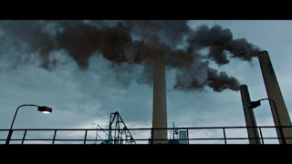
The film opens with an establishing shot, the colours are darkened to suggest that there is danger ahead in the story.The grey skies and rain on the ground are pathetic fallacy to suggest the mood of the film will be dark at times.This is reinforced and furthered by the low key lighting. Both of these things lead the audience to feel suspense because they want to know what's going to go wrong. The non diegetic music is a happy sounding Milton theme tune. This contrasts to the dark mood making the audience feel uneasy. The setting includes a factory which is visibly polluting it, this suggests that although the danger is not imminent it may build up to something catastrophic the way that pollution does. It also makes the audience feel fear as it suggests danger on the horizons through the composition as the pollution is in view but far away enough to be safe from where the shot is taken. There is a slight bright patch at the end of the road but it seems out of reach making the audience believe that the chase of a happier outcome is difficult but gives them enough hope for them to remain interested. The setting is also quite bland, this draws attention to the sign. The font of Milton is bigger than the rest of the sign making the audience want to know more about what Milton is as the boldness of the work suggests it's important.
Up until this shot all of the colours in the film have been cold colours meaning that the audience feel the sadness of the blues and greys. In this shot the pink on the Milton van contrasts and the warmth and brightness of the colour makes the audience feel warm towards Milton. It also draws attention to it meaning that this shot suggests Milton is important to the story. The costumes of the two people in the shot are cold colours that blend into the setting so that they do not draw attention from Milton, this reinforces its importance.
It then begins inter cutting from the Milton factory to the cartoon screen to reinforce the contrast of the blood and the happy Milton scene. The sudden changes keep the audience alert. To make the contrast stronger they emphasize Milton as much as they can. One way they do this is a close up of the Milton stickers with bright, saturated colours. These contrasts also build enigma because audience want to know what can make the happy Milton scenes into the violent scenes.
Narrative
The opening doesn't give much away as far as the plot of the film goes. It begins at an equilibrium to fit Todorov's theory. This suggests that the plot begins at the beginning of the story.
The age rating is 15, the cover is quite comical suggesting that it is for all ages. Because of this I think that it suits the age group I am aiming for quite well. It is a 15 because of its use of violence. This suggests that a bit of violence would suit my age rating well. I am therefore going to include suggestions of violence in my opening but not enough so that it would have too much and be classed as an 18 which wouldn't be appropriate for my target audience. The BBFC says that 15's should not dwell on the wounds so even though I am including a suggestion of violence to keep the film interesting for my target audience, I shouldn't show particularly violent aftermaths as it wouldn't be appropriate. This opening contains cartoon violence to make it interesting to the target audience but as it's cartoon it does not breech the BBFC's classification of a 15 film.
Evaluation
I like the way that they contrast the happy scenes with more violent scenes and I would like to incorporate this in my own project. However, I don't like the way that they didn't give any glimpse into the actual story of the film so when making my own I am going to make sure that the opening hints at what the rest of the film could include.


Freya, there is some evidence here that you understand the techniques used by the thriller openings you have chosen, and you have used some terms and theory. However, I know you can write much more detailed analysis than this - it's really too short for the grades you should be aiming for. The analysis above is really only 2 paragraphs, and yet 2 pages is really the length you need, with many more images, use of terms from all 4 technical codes, narrative theory and analysis of character. This is currently level 2 work.
ReplyDeleteFreya - can you improve this work as I've suggested above please? This needs to be done before the process goes on too far.
ReplyDelete